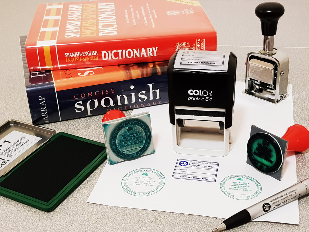
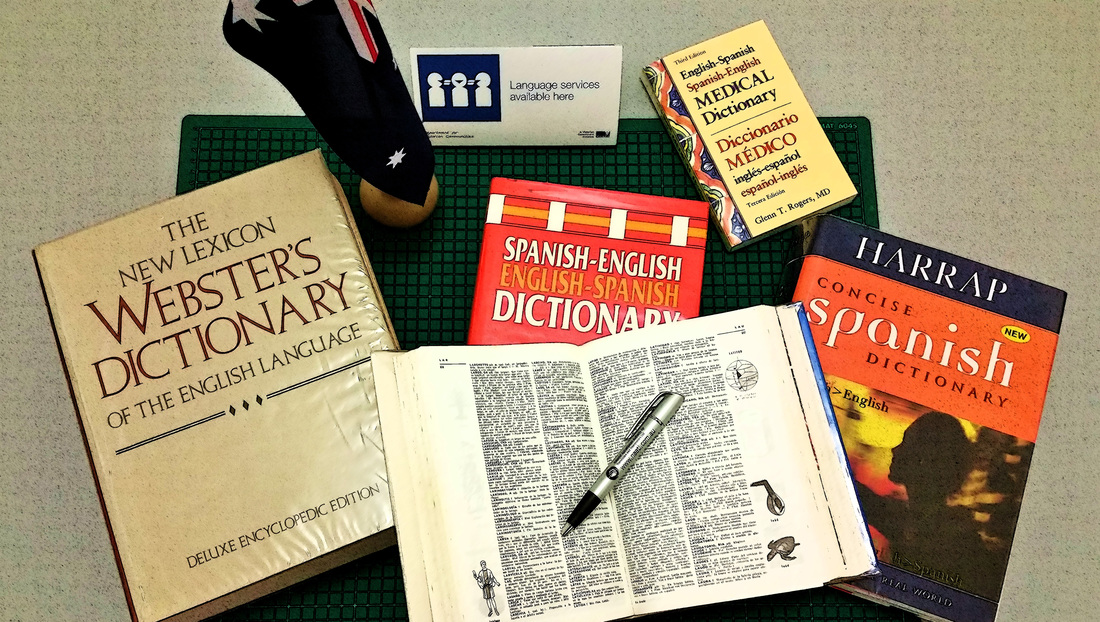
Our office is proud to announce that we have both NAATI Accredited and NAATI Certified Translator Stamps. The NAATI Translator Stamps are used to certify translations. As NAATI recognises both stamps as official, all our Official English <> Spanish Translations will bear both an NAATI Accredited Translator Stamp and a NAATI Certified Translator Stamp. For our clients this means their translations are double guaranteed. While the NAATI Certified Translator Stamp displays an expiry date, this date only refers to the potential expiry date for the Certified Translator credential at the time the stamp was issued, and does not reflect an expiration date of the translated documents. Hence, although the NAATI certification has an expiry date and is subject to renewal every 3 years, the translations produced are valid permanently. For further information, please view the NAATI information sheet: https://www.naati.com.au/media/1871/naati-translator-stamp-infopdf.pdf On the other hand, the NAATI Accreditation is permanent -- that is, for life. To quote an email sent by NAATI: "Transitioning to NAATI certification does not mean you will lose your existing NAATI accreditation or recognition." [See PDF version of email on right.] Our Accreditation number: 43325, and our Certification Practitioner/ID number: CPN2GA02L, can be verified at the NAATI website: https://www.naati.com.au/. Just click 'Recourses' in the navigation bar, and select either 'Verify a NAATI Accreditation' or 'Verify a NAATI Certification', respectively. | NAATI Translator Stamp Information Sheets and Email Confirming Permanency of NAATI Accreditation
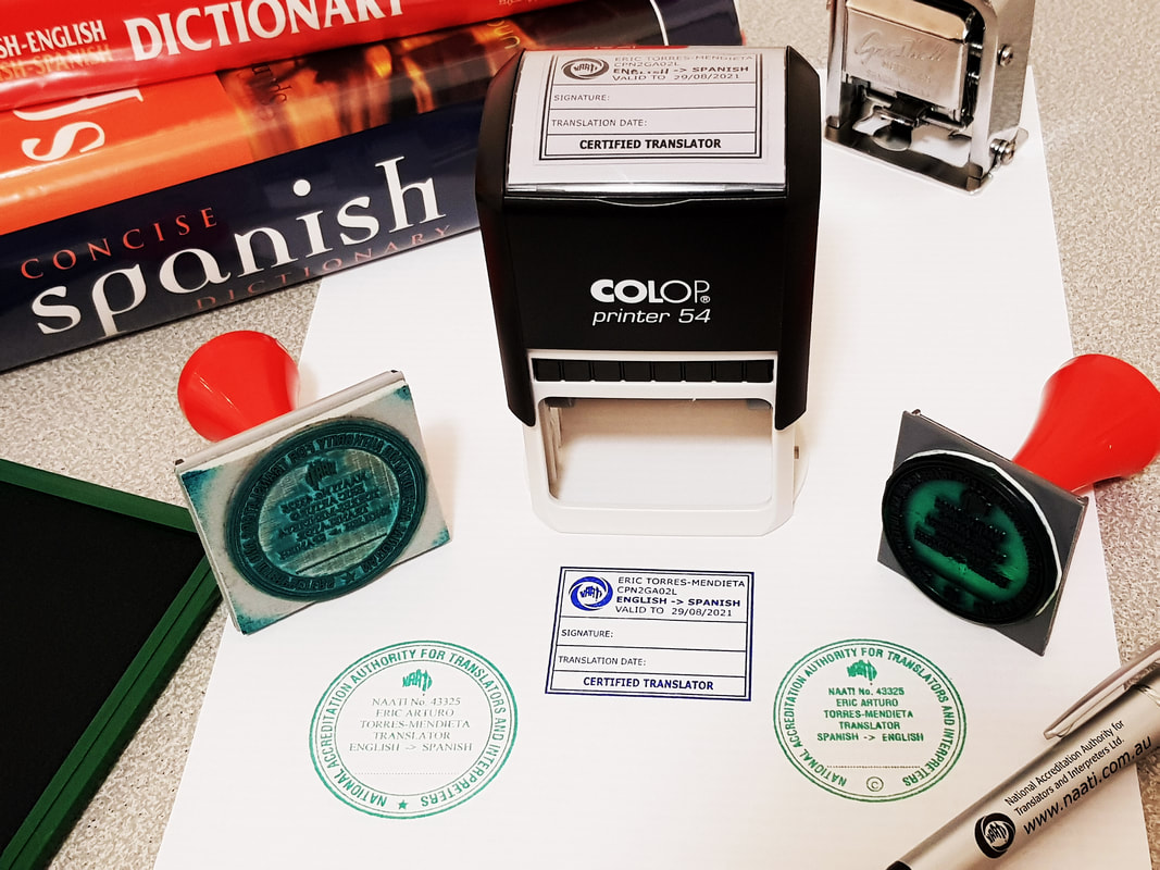
|
2 Comments
In this fourth instalment, we would like to highlight the image from our 'Services' page. The previous blog entries in this series can be found here: Part I, Part II and Part III. ATIS Services Page ImageFor any website offering services, it needless to say, that their Services page is of importance. Indeed, it is here where they show potencial clients their range of services how their services would help in achieving the client's goals. For ATIS, it's no different; our Services page highlights our range translations and language services. With this photograph, I wished to represent how ATIS can service all size of clients: from individuals to large organisations. Furthermore, ATIS can service wide range of project sizes: from small single paged documents to large and complex translations projects.
I wished this, no project or client too small or big ability of ATIS, to be displayed with the juxtaposition of the big and small bilingual (Spanish<>English) dictionaries, each with it's respectively sized peg. What do you think about this image? In this third instalment, we would like to highlight the image from our 'How the Translation Process works' page. The previous blog entries in this series can be found here: Part I and Part II. Little Red DictionaryFor our 'How the Translation Process works' page, the image I wanted to display needed to show that we care for our clients. Furthermore, it had to depict what we do; that is, deliver high quality Spanish <> English Translations and Interpretation services. I believe the photograph does capture the desired message. Would you agree? The hand, perhaps like the human face but to a lessor extent, can express powerful messages, expressions and emotions. Indeed, the hand is not only a tool but also a most valuable part of non-verbal communication. A hand can tell you to proceed or stop, it can show love and care or anger and aggression. This little red dictionary is a cute miniature. I knew it would indeed came in handy. Of course, dictionaries and other language recourses are essential to translators and interpreters; they are an important tool for us. Below is the original colour photo: (For those wondering, the hand photographed is mine; and yes, I also took the photo with my other hand)
In continuation from last week's blog post, this post will highlight another original photograph from our website. ATIS Home Page ImageThe home page image is important. Indeed, it is probably the fist image a visitor will see. Therefore I wanted an image that would say both 'Spanish' and 'English'. I wanted an image that shows professionalism, languages, reading, verification, consultation and work with words. At the same time, the image needed to show that we are Australian.
Books, in particular, dictionaries, were my first instinct. Dictionaries and other language references are essential tools for any translator (or interpreter for that matter). The NAATI pen was a nice method to depict writing and work. And, obviously, the tabletop Australian flag was the ideal way to show our Australian-ness. In addition, I wanted to give a slight hint what, among other specialities, we can do medical/health translations or interpreting projects. I hope this simple photo contains all the elements I wished to show. What do you think? (For those wondering, the open dictionary is a Larousse Spanish Dictionary, chosen for it's illustrations.) As many are aware, earlier this year we developed and launched our new ATIS website. That period was busy. We did a number of things to freshen our home-business. Among some of the things: we updated some of our IT hardware and software, we rethought our marketing strategy, we wrote new page content for the website, and took new photographs for the website. Taking new original photographs was a fun process but also takes some work. Before anything, one needs to come up with a concept, a message. One needs to consider space, props, lighting, angels, and colour among other thing. Then setting up for the shoot is an activity in itself. Often at this stage, one encounters an obstacle that demands rethinking of the image. Indeed, taking a good photograph takes time. But the process doesn't end there. Editing the image ready for website display sometimes takes even more time. Of course not every single image on our website is new nor original. However, a number of our key images are. These photos were taken and edited by myself, Eric Manuel Torres. Starting with this week's blog post, I would like to highlight some of the original photographs I took for the new website. I enjoyed producing them and I hope you also enjoy viewing them. 'ATIS' LettersTo start of this series of blog post, I would like to highlight the photo depicting the "ATIS" letters. The above photo is the final edited version. If you see closely, the each of the letters is, in fact, two; one white staked on a black. This seems to create depth. The hardwood background gives the image the appearance of a classical look. The image hopefully transmits a sense of age and experience, but at the same time, new and fresh. The original photograph did not look as good as the final edited image. It looked dull and somewhat lifeless. This goes to show how some image editing can make a lot of difference on the final look of the photo.
|
AuthorEric Manuel Torres, Executive Director (CEO) of ATIS shares thoughts on the Translation and Interpreting industry in Australia and also news about the family business. Also to view our Founding Director and Chief Translator's (Eric Arturo Torres-Mendieta) LinkedIn profile, please click below:
Archives
July 2018
Categories
All
|