In continuation from last week's blog post, this post will highlight another original photograph from our website.
ATIS Home Page Image
The home page image is important. Indeed, it is probably the fist image a visitor will see.
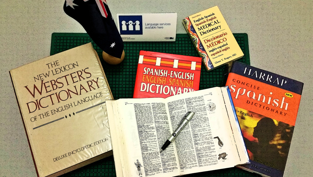
ATIS Website 2015 Home Page Image - Photo by Eric Manuel Torres
Therefore I wanted an image that would say both 'Spanish' and 'English'. I wanted an image that shows professionalism, languages, reading, verification, consultation and work with words. At the same time, the image needed to show that we are Australian.
Books, in particular, dictionaries, were my first instinct. Dictionaries and other language references are essential tools for any translator (or interpreter for that matter). The NAATI pen was a nice method to depict writing and work. And, obviously, the tabletop Australian flag was the ideal way to show our Australian-ness.
In addition, I wanted to give a slight hint what, among other specialities, we can do medical/health translations or interpreting projects.
I hope this simple photo contains all the elements I wished to show. What do you think?
(For those wondering, the open dictionary is a Larousse Spanish Dictionary, chosen for it's illustrations.)


 RSS Feed
